2019-2020 UX UI 交互设计趋势 Dribbble 追波 和 behance 上UX用户体验设计总结
之前分享过《追波(Dribbble)和behance 上的大神预测的 2019-2020 视觉图形设计趋势》 和《追波(Dribbble)和behance 上的产品或企业卡通IP形象 2019 – 2020 设计趋势总结》和,而这次分享的是,《2019-2020 UX设计趋势 Dribbble 追波 和 behance 上UX用户体验设计总结》这些文章都可以帮助您快速吸收 未来2年的设计流行趋势,让您能快速设计出 最新最流行的作品,所以不要犹豫,收藏他们把!

在本文中,我们将分享ISUX设计趋势报告的最后一部分“用户体验趋势”。
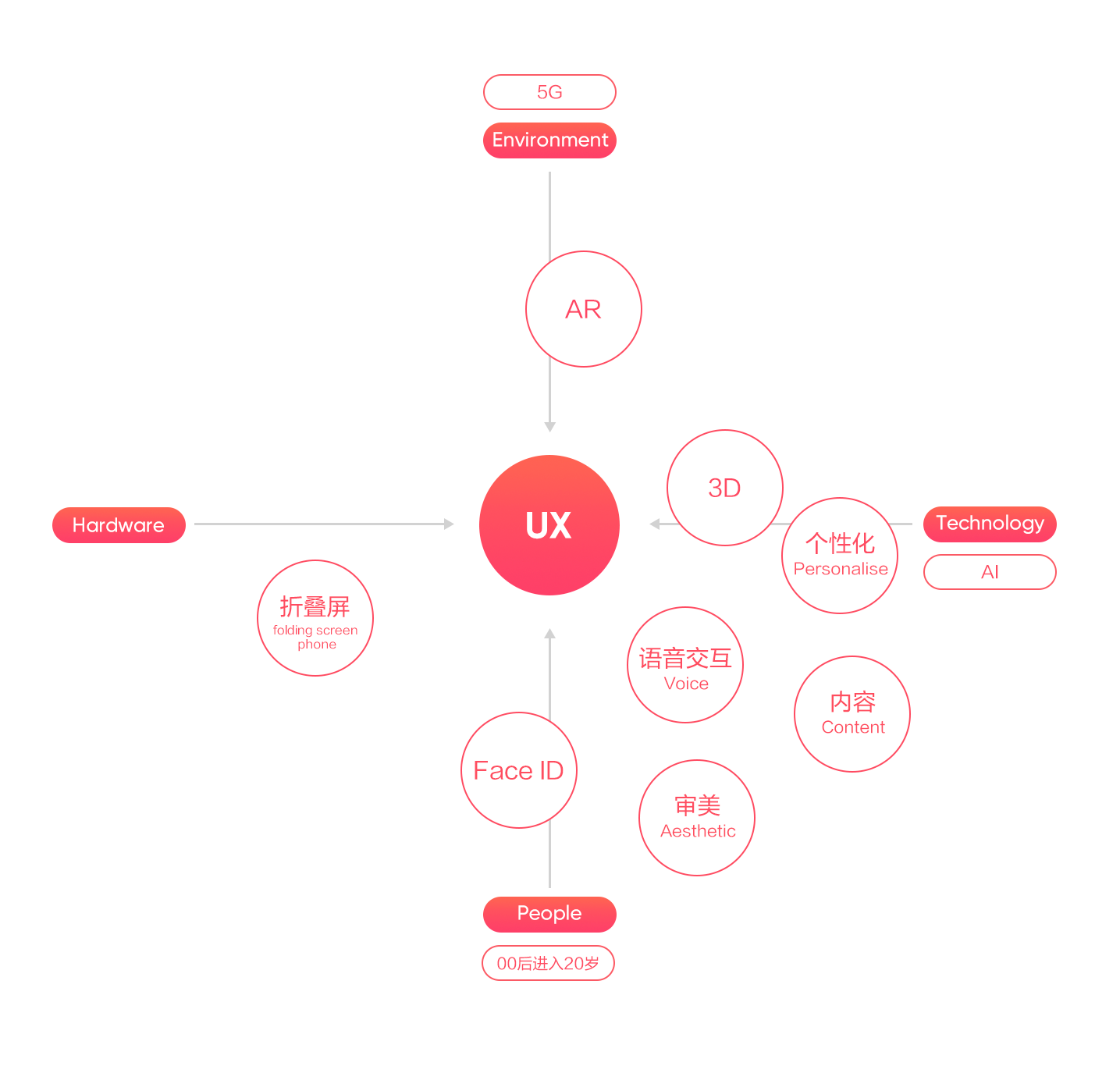
用户体验是产品、人与环境共同作用下,用户使用产品的感受。随着科技不断进步,新的产品和服务层出不穷,消费者的行为和心理也在不断变化。我们从技术、硬件、环境和人四个维度,来分析和总结用户体验趋势,在这个多变的行业中,大家进行新的设计和改进设计时,加以对趋势的了解,为即将到来的未来做准备。
In this article, we will share the last part of design trends: “the UX design trend”.
User experience is the feelings of users when using products, under the joint action of products, people and the environment. As technologies develop, and new products and services emerge in an endless stream, the behavior and psychology of consumers are constantly changing. We will analyze and summarize the user experience trends from four latitudes: technology, hardware, environment and users. In this changeable industry, we have to understand these trends when we are designing and improving new designs, and preparing for the upcoming future.
为了更好的了解趋势出现的原因,我们从影响趋势的客观条件中归纳了一些信号:
In order to better understand why there are these trends, we have summarized some signals from the objective conditions that influence the trend:
2019年是5G元年
2019 is the first year of 5G
思科最新研究表明,2022年,全球近12%的移动数据流量来自5G连接。5G超高速率让内容推荐更加个性化和精准化,万物互联会带来更多的智能终端和更多细分场景,AR将会有更多应用场景。
The latest research from Cisco shows that, nearly 12% of the world’s mobile data traffic comes from 5G connections in 2022. The 5G extreme high rate makes the content recommendation more personalized and precise. The Internet of everything will bring more intelligent terminals and more subdivision scenarios, and AR will have more application scenarios.
2019年00后进入20岁
The Post-00s entering 20 years old in 2019
00后的特点更加多样化,千人千面时代到来。他们喜欢多社交和多互动,内容是激发他们互动的工具,会对自己感兴趣的领域投入更多时间和金钱。
Their characteristics are more diverse, and there are a thousand Hamlets in a thousand people’s eyes. They like to be more social and interactive, and content is a tool that motivates them to interact and invest more time and money in areas of interest.
人工智能技术加速落地和扩大应用
AI technology accelerates landing and expands applications
近年来,人工智能技术在移动互联网广泛应用,人工智能手机研究报告指出,消费者最常用的AI功能有语音助手、人脸解锁、智能识图、智能拍摄和美颜,围绕语音和视觉的核心应用场景技术将会持续升级。
In recent years, AI technology has been widely used in mobile internet. The research report of artificial smart phone indicates that the most commonly used AI functions of consumers are voice assistant, face unlocking, intelligent map, smart shooting and beautifying. The core application scenario technology surrounding by voice and vision will continue to be upgraded.
智能手机的差异化
The differentiation of smart phones
全面屏的出现,让Face ID逐渐取代了Touch ID;各大手机厂商也试图在产品形态上创新,推出了折叠屏手机。
The emergence of the full screen, Face ID gradually replaced the Touch ID; major mobile phone manufacturers also tried to innovate in the form of products, launched a folding screen phone.

互联网的产品从大众化转向个性化,越来越多的产品通过定位细分找到了新的机会。设计从同质化的体验转向追求个性化和创新。设计师必须了解与自己完全不同的目标人群,进行用户细分研究,通过良好的用户体验留住用户,提升产品价值。
Internet products have switched from popularization to personalization, and more and more products are finding new chances via targeting segmentation. The design has changed from the experience of homogenization to a pursuit of personalization and innovation. Designers have to understand the target population that is completely different from their own, conduct segmentation user researches, and improve the product values by excellent user experience to retain users.

在大数据背景下,个体兴趣多样,随着机器学习和人工智能的技术的发展,产品越来越注重个性化推荐。
In the background of big data, there are multiple individual interests, and with the technical development of machine learning and artificial intelligence, products should focus more on personalized recommendations.
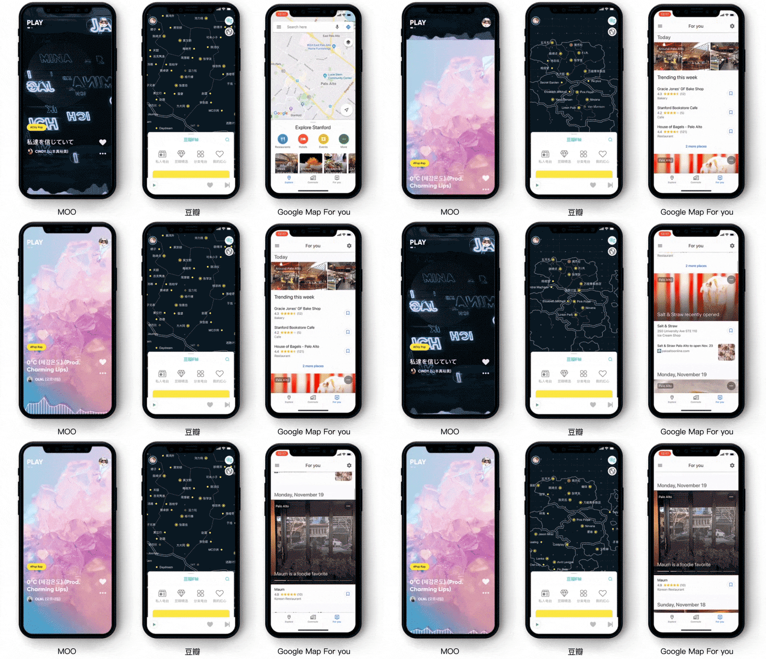
“更懂你”的信息流推送让用户不需要从一堆歌单中去寻找你喜欢听的歌曲,豆瓣的音乐地图和Google的For you让你的偏好一目了然。
The “More understand you” information stream does not need users to search for songs they like from a bunch of song lists. Douban music map and Google Map For you to make your preferences clear.

用户经常在不同地方使用手机,场景化生活特征被互联网设备所感知。设计师需要感知用户当前场景,理解当前场景的需求来进行精准的应景设计,提升用户的惊喜感和愉悦感。
Users are often using their phones in different places, and scenarization life characteristics can be perceived by internet devices. Designers need to perceive the current scene of users, and design accurately by understanding the requirements of the current scene, in order to improve the sense of surprise and happiness.
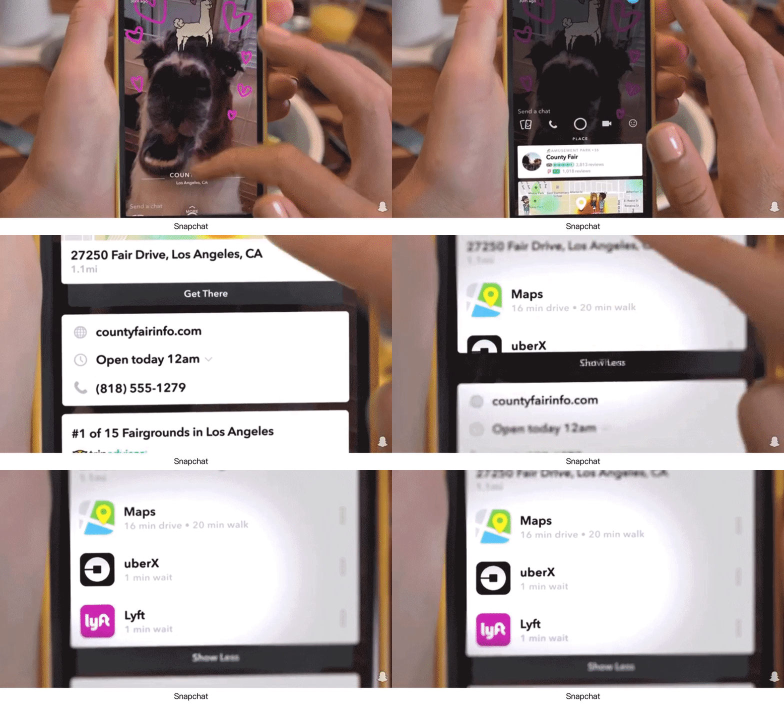
Snapchat能识别聚会拍照的地点,在app里在线预定打车到那个位置。
Snapchat can recognize the locations of where people are photographing in a party, and then they can book a taxi to this place online in the app.
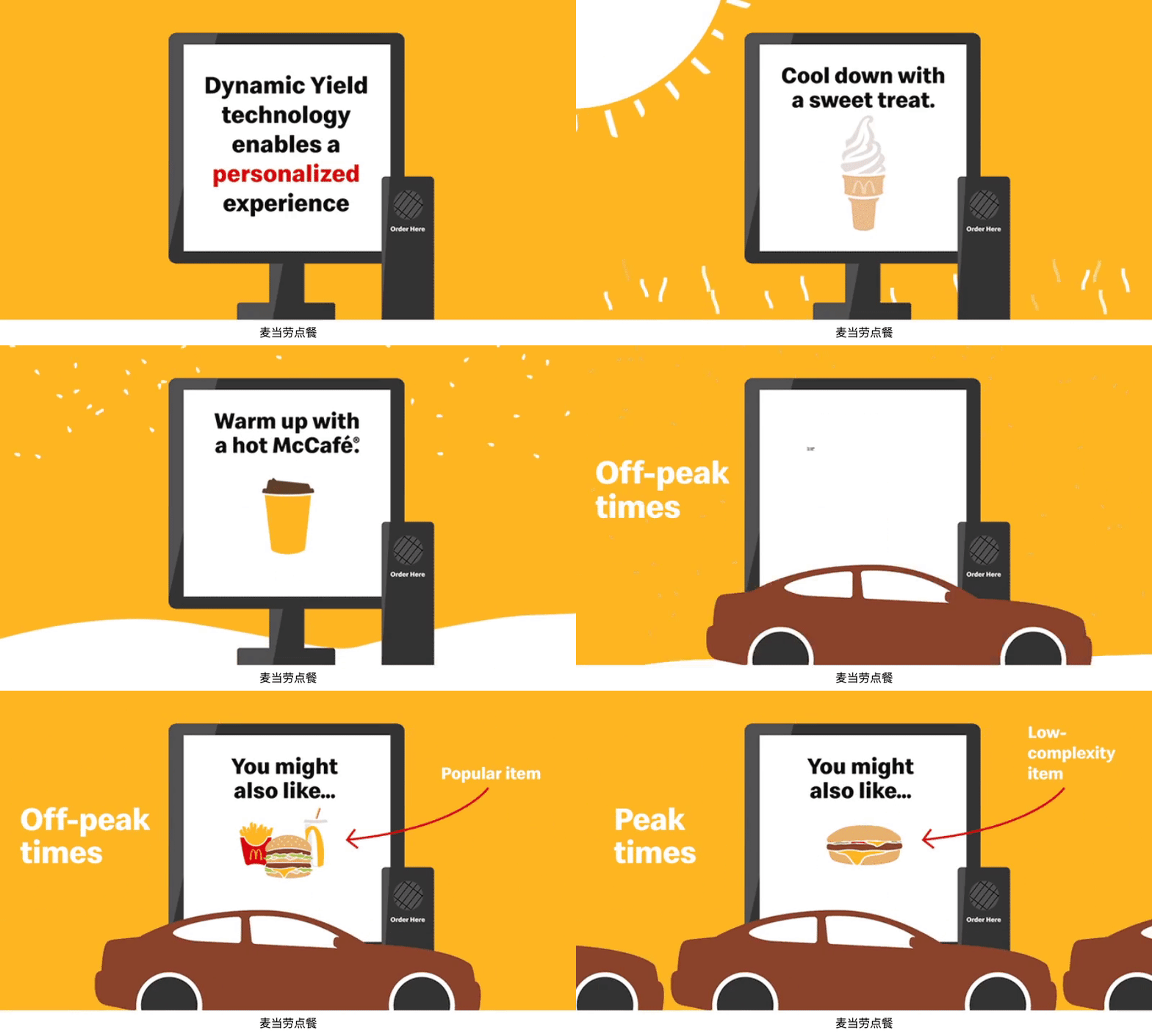
麦当劳个性化推荐技术,让餐厅根据天气、时间和顾客的点餐记录来调整菜单。
McDonald’s has a personalized recommendation technology, which can allow the restaurant to adjust the menu according to the weather, time and order records of consumers.
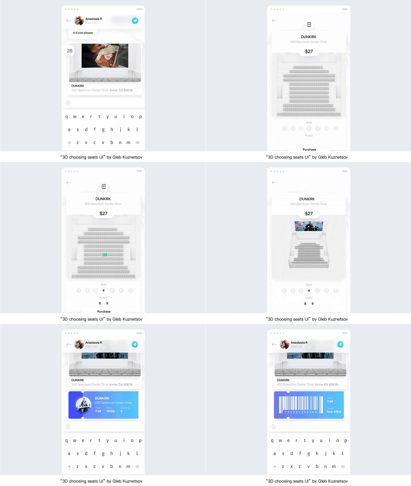
在电影院选座位能感受到座位的真实观影角度,快到电影院时会推送电影票二维码。
Users can experience the real viewing angle of the seat when they choose a seat in the cinema. The app will provide the ticket QR code when a user has nearly arrived at the cinema.

AI语音技术的快速普及,帮助人们改变使用习惯和观念,用户越来越多的使用语音交互。据ComScore的报告称,预计在2020年,用户使用搜索功能时,50%会用语音搜索;72%拥有智能语音助手的用户表示这已成为他们生活的一部分。各大科技公司出了自己的智能音箱,AI智能设备改变了与界面的交互方式,从GUI到VUI,不依赖触摸屏的输入,出现无导航、无按钮、无菜单界面。就目前而言,国内的AI音箱还是比较初级的人工智能,经常被用户病垢为人工智障般的语音系统。
As AI voice technologies rapidly popularize, which helps people change habits and concepts, the users are increasingly using voice interaction. According to the report from ComScore, 50% of all searches will be voice searches in 2020; and 72% of users who have a voice assistant said that this has become part of their lives. Lots of tech-companies show their own smart speaker, and AI devices have changed the interaction with interfaces from GUI to VUI, and it doesn’t rely on the touch screen input, and provides the no navigation, no buttons, and no menus interfaces. Currently, domestic AI speakers are still a relatively primitive AI, and are often called by users as an artificial foolish voice system.

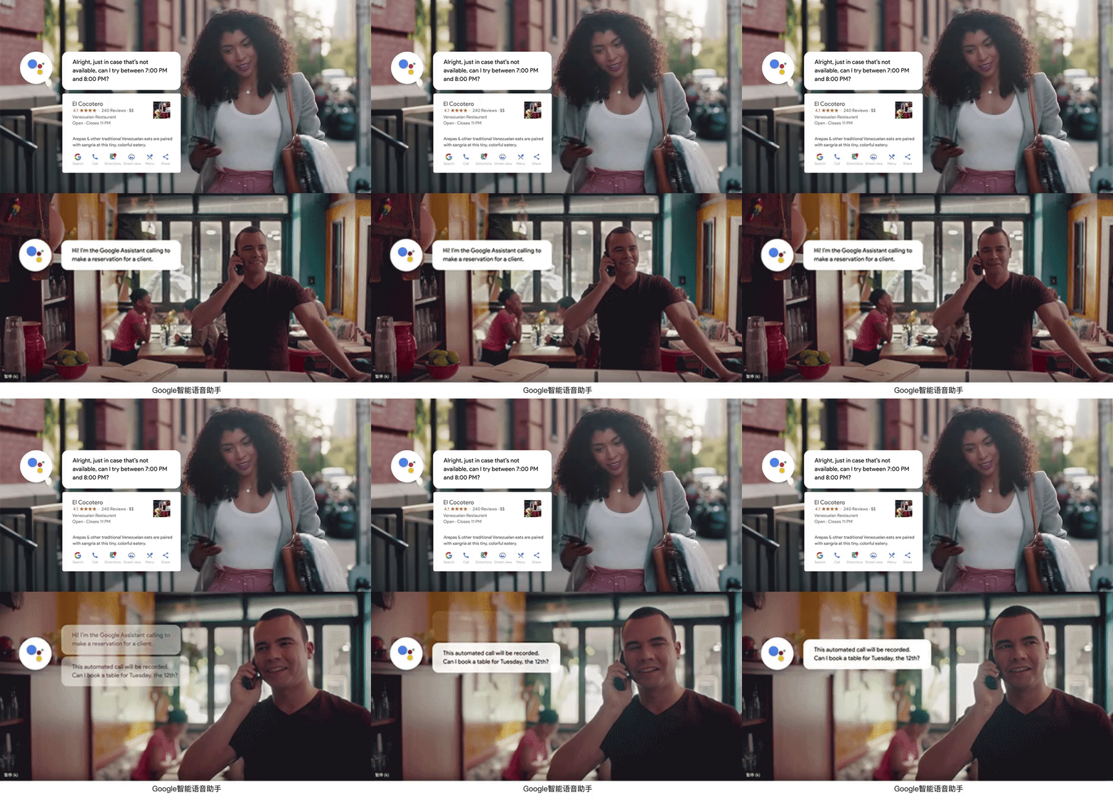
随着人工智能和机器学习的不断发展,Google的智能语音助手快速进化,从去年I/O发布的Continued Conversation(连续对话),用户不用每下一个指令都要说一声‘hi google’,到今年已经不需要说唤醒词,拿起手机就可以让它帮助你。
去年发布的Google Duplex,可以打电话给饭店或理发店等商家,帮你预约,到今年可以帮你租车、回复消息、找照片分享给好友、写邮件等一系列跨app的任务。
With the continuous development of artificial intelligence and machine learning, Google’s intelligent voice assistant has evolved rapidly. From the Continued Conversation published at last year’s I/O, users do not have to say ‘Hi Google’ for every instruction, and this year, the users do not need to say wakeup words, but just pick up the phone and let it help them.
Released last year, Google Duplex can call a restaurant or a barbershop to make a booking for you. This year, it can help you rent a car, reply to messages, find photos to share with friends, write emails, and do other cross-app tasks.
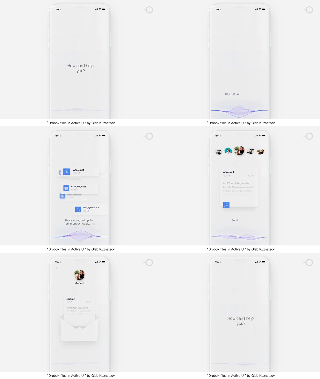
技术进步必然带来效率的提升,AI越来越能全面理解用户提出的高度个性化需求,语音交互可以像人与人互动一样自然且同时快速处理跨app的多任务,降低用户操作成本,缩短操作链路,成为用户的日常“助手”。
The technological advancement will inevitably lead to efficiency improvement, as AI can more and more completely understand the highly personalized requirements put forward by users, and the voice interaction can be as natural as a human’s, and it can fast process the multi-tasks that are cross-app as well. VUI can reduce user-operating costs and shorten the operation process chains, and it becomes the daily “assistant” of the users.

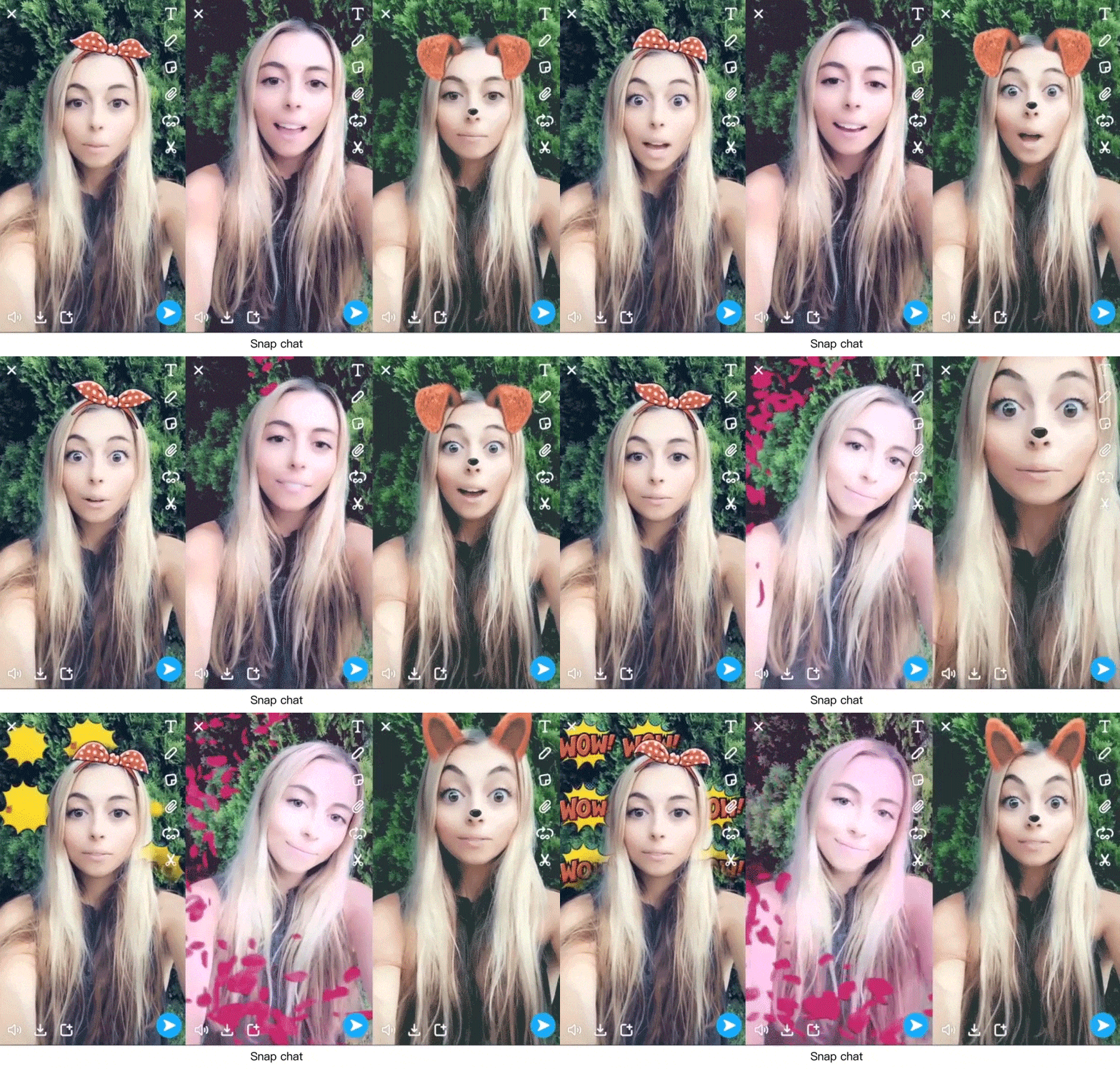
对用户来说,语音的使用不仅仅是它的便利性,娱乐性也是重要因素之一。短视频在声音交互和语音识别上进行了补位。Snapchat推出声音滤镜,不仅能根据声音音量做出反应,还能识别语音指令,触发对应的动画。
For the user, the use of voice is not only its convenience, but entertainment is also one of the important factors. Short videos are complemented in voice interaction and speech recognition. Snapchat introduces a sound filter that not only responds to sound volume, but also recognizes voice commands and then triggers corresponding animations.
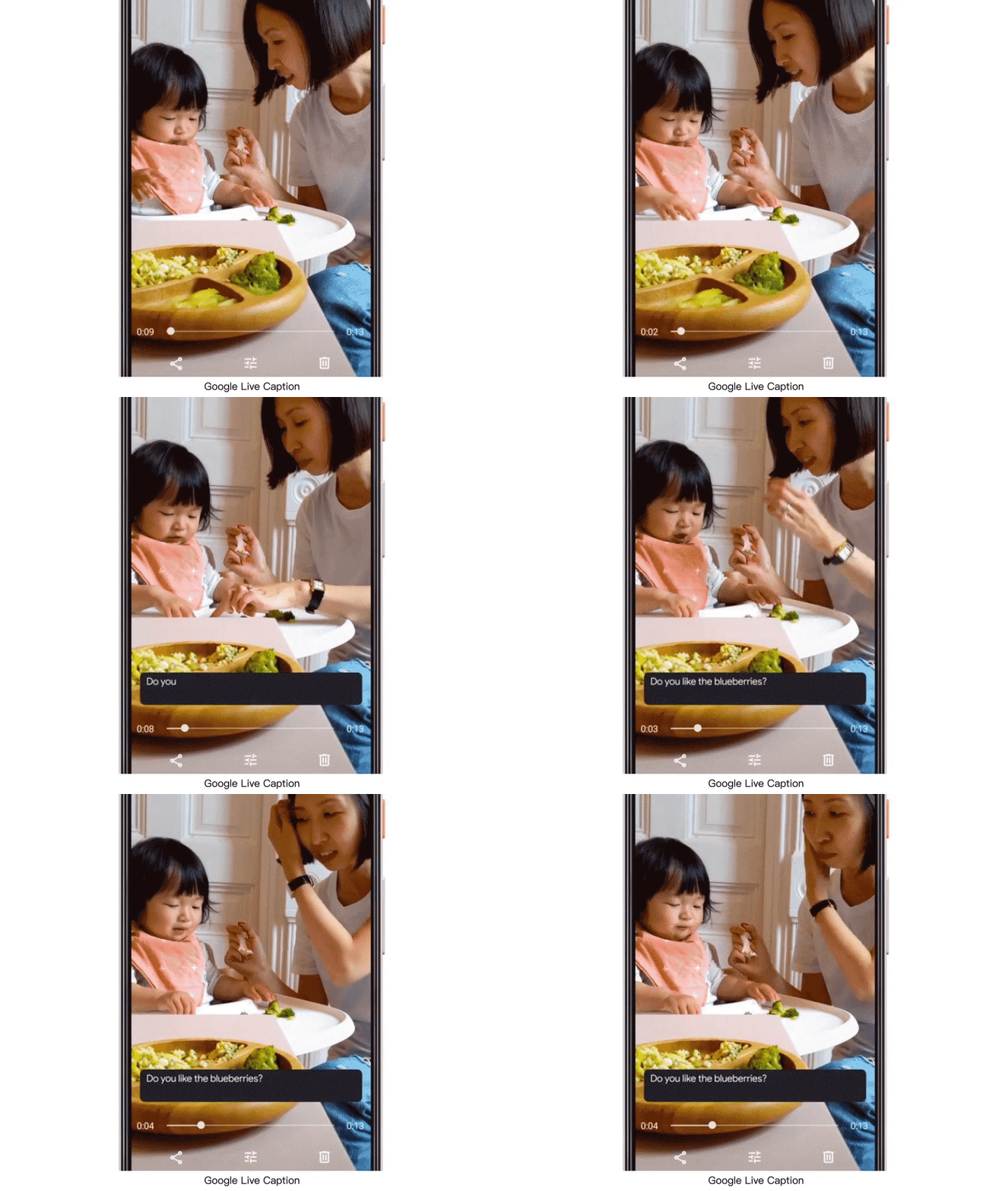
Google的Live Caption的语音识别技术,可将视频语音内容转化成文本字幕显示在聊天界面,还可识别关键词,形成文本链接,用户可直接点击跳转。
Live Caption voice recognition technology from Google converts video voice content into text subtitles and displays them in the conversation interface. It also recognizes keywords and forms text links, and then users can click and jump directly.
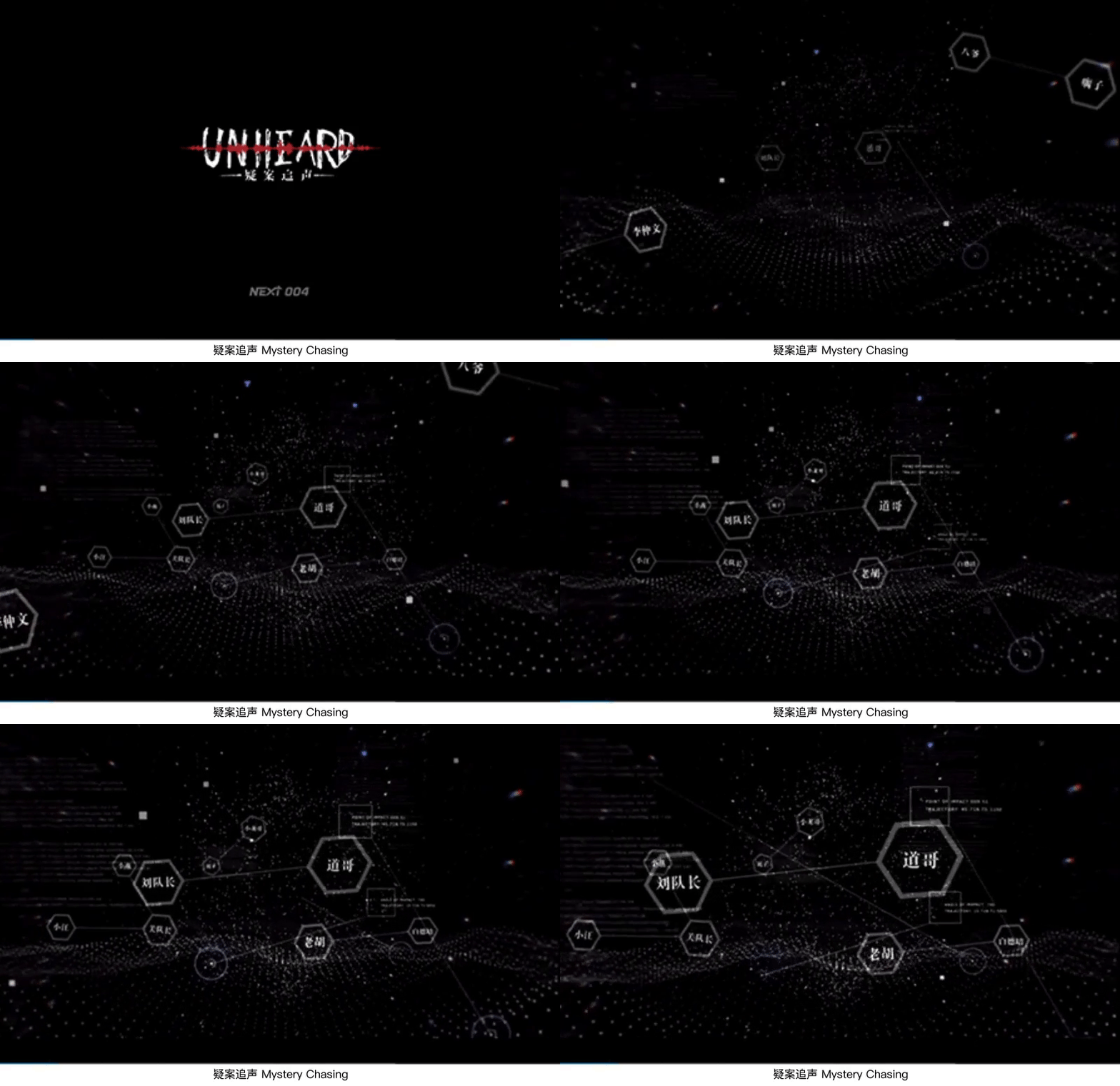
声控游戏和声音社交不断兴起,语音让体验更加多元化。腾讯NEXT新作《疑案追声》,以声音表现故事,听声音进行推理破案,用声音来打造沉浸式体验。
With the constant rise of the voice-controlled game and voice social media, voice makes the interaction more diverse. Tencent NEXT new work “Mystery Chasing” expresses the story with sound, listens to the sound and makes the reasoning and solve the case, and uses the sound to create an immersive experience.

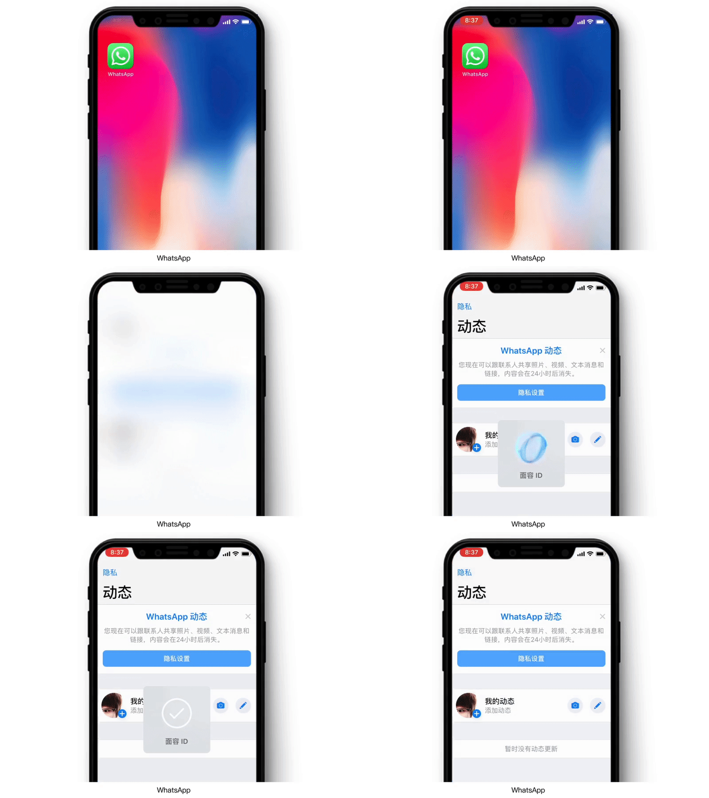
登录app身份认证从以前五花八门的“用户名+密码”的模式优化到获取手机动态验证码,这种身份校验的方式在使用体验上谈不上好用。验证码的收取、输入都需要用户花费一定的时间和精力。全面屏手机的出现使Face ID取代了Touch ID,当全屏设备越来越普及时,越来越多的app将加入面部识别认证,实现更实时更精准的一键登录。
Login app authentication is optimized from the previous “user name + password” mode to get the mobile phone dynamic verification code. Identity verification is not easy to use in the experience. The receiving and inputting of the verification code requires the user to spend a certain amount of time and effort. The appearance of full-screen phones has replaced Touch ID with Face ID. As the full-screen devices become more popular, more and more apps will be added with face recognition authentication, to achieve real-time and a more accurate one-click login.

各大手机厂商为了调动消费者的换机热情,从全面屏、升降摄像头、双面屏到最近的折叠屏,手机新形态的出现会带来不一样的操作体验。
In order to mobilize the enthusiasm of consumers, the mobile phone manufacturer has developed it products from the full screen, lifting camera, and double-sided screen to the recent folding screen, and the emergence of new forms of mobile phones will bring a different operating experience.
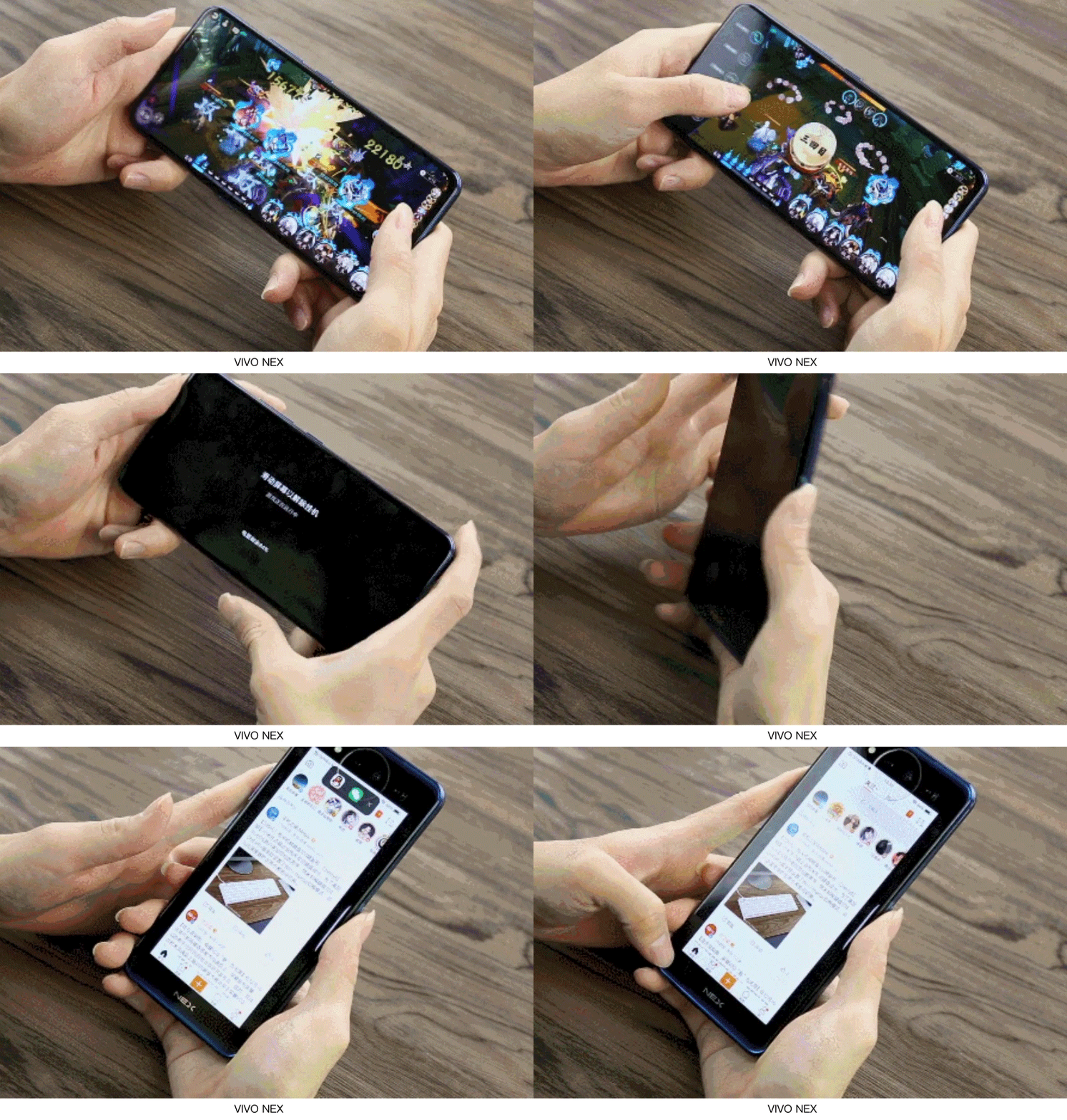
折叠屏折叠时能让手机背面成为一个附加的交互空间,方便用户同时使用两块屏幕进行不同app操作,例如打游戏的同时,不用切换退出游戏,直接翻过屏幕处理社交消息。
A foldable screen can make the back of the phone become an additional interactive space, which is convenient for the user, as they can use two screens at the same time for different app operations. For example, a user is playing a game, meanwhile without switching out of the game the user can be directly turning over the screen to process social messages.
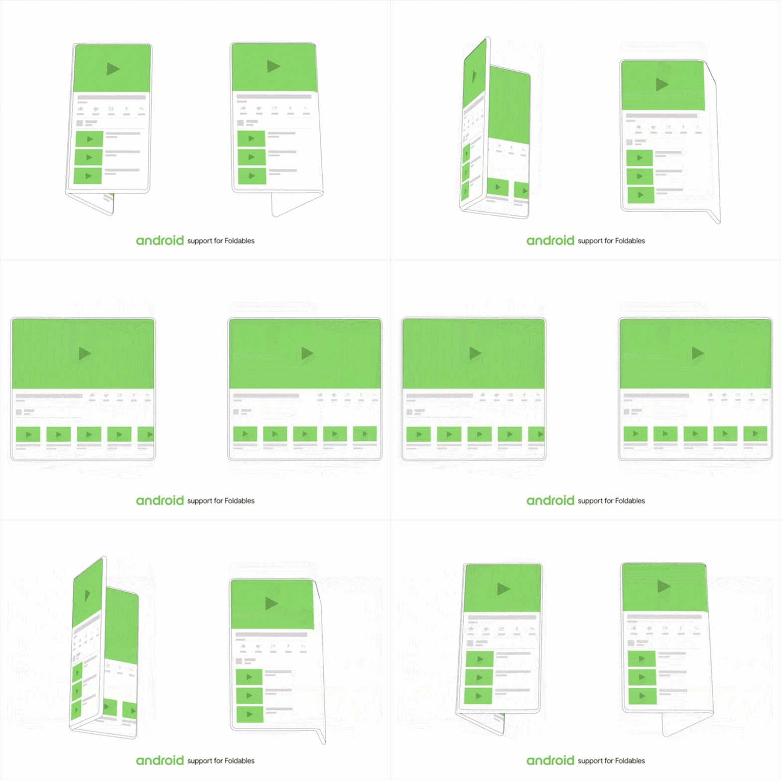
折叠屏展开能使空间更大,在小屏中运行的app,会自动调整大小匹配大的布局,并展示更多的功能。 还可以进行多窗口操作,避免多个应用之间来回切换
Foldable screen expansion can make the space bigger, and has an app running in the smaller screen. The screen can automatically adjust the size to match large layout, and show more functions. It can also perform multi-window operations, to avoid switching back and forth frequently between multiple applications.
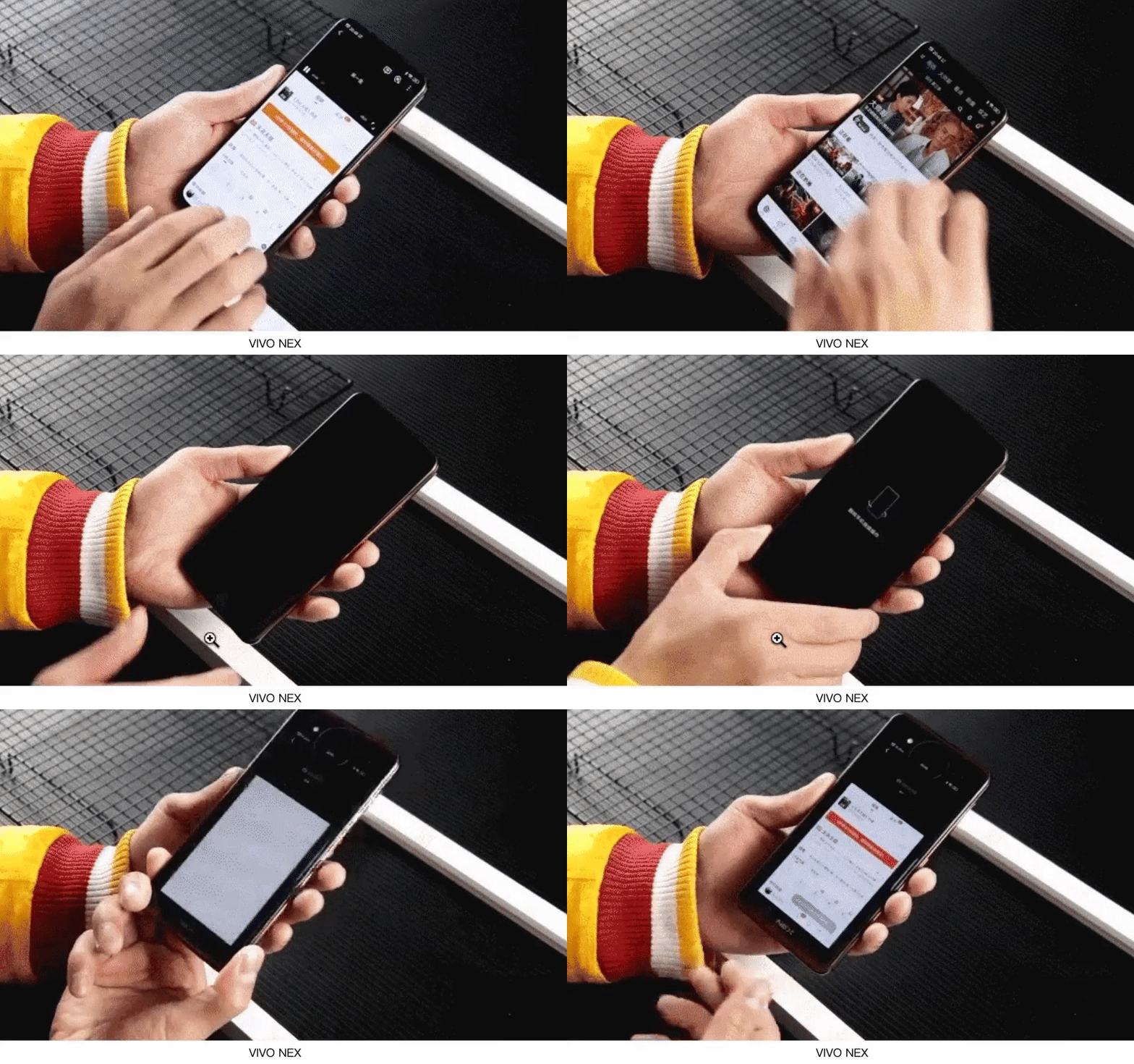
全屏手机的出现,让手势操作取代物理按键。折叠屏的出现,双屏幕的操作会增加更多手势操作,需要在设备中模拟人的自然的、习惯的手势。
The appearance of full-screen phones allows gestures operation to replace physical buttons.With the appearance of a folding-screen, the operation of a dual-screen will have more gesture operations, and it is necessary to simulate the natural, customary gestures of the person in the devices.

AR技术会随着5G发挥更大价值,创造更多的新场景。人们借助AR,能让原本虚构的数字世界融入到现实的物理世界。2018年Gartner调查显示,2020年,约有46%的零售商计划将AR/VR技术融入到顾客的购物体验中。
AR technology will play more of a valuable role with 5G and create more new scenarios. People can integrate the original fictional digital world into the real physical world via AR. According to the Gartner survey in 2018, about 46% of retailers plan to integrate AR/VR technology into their shopping experience in 2020.
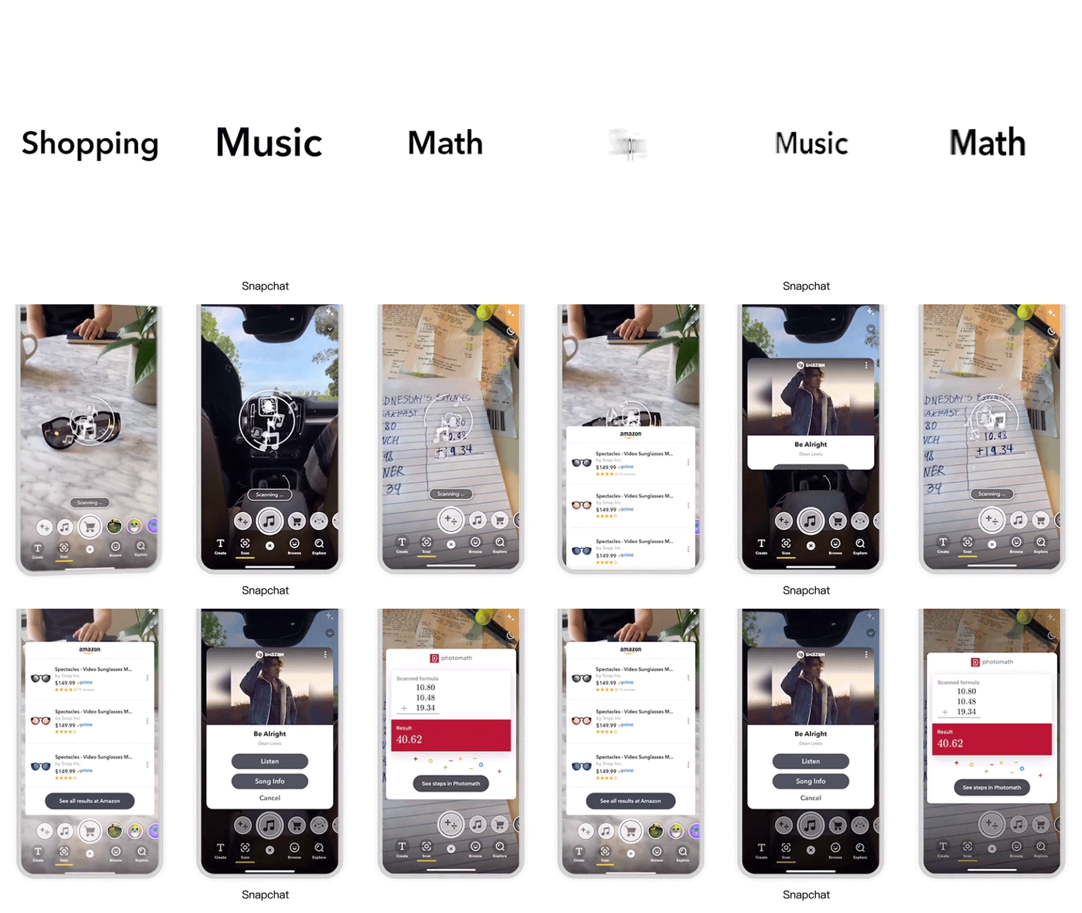
Snapchat可以使用相机扫描物理对象,会展示Amazon的购买链接,还可以扫描歌曲或者数学题。
Snapchat can use the camera to scan physical objects, display Amazon’s purchase links, and scan songs or math problems.
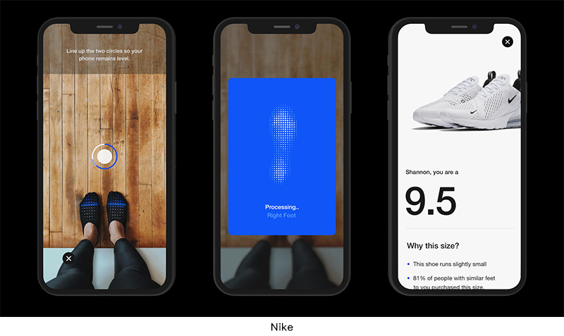
通过Nike App的“扫一扫”,对双脚进行全面扫描和评估,会有左右脚长宽显示,根据选择的运动鞋款,会推荐该鞋款最适合的鞋码。
The “Scan” of the Nike app can fully scan and evaluate feet, and displays the length and width of the left foot and the right foot. According to the selected sports shoes, the most suitable shoe size will be recommended.
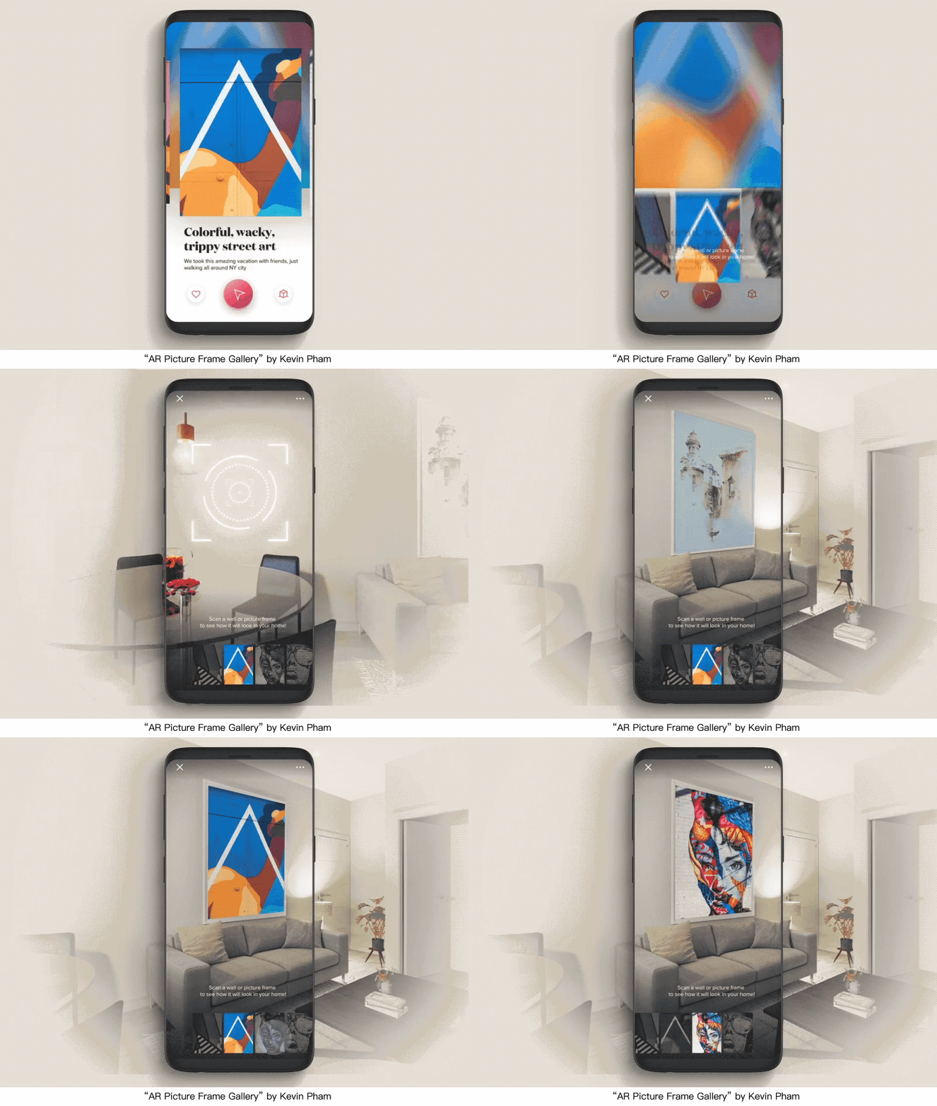
AR让数字世界的物体更具象。当你搜索到想买的一副画,可通过AR把画放入现实场景中,用一种全新的方式看看该物体的大小、颜色和自己家搭不搭。
AR makes objects in the digital world more figurative. The user can put the painting into the real scene through AR when they want to search for a painting and want to buy one. The painting can be set in a real scenario via AR, and the user can check out the size, and color and whether it matches their home style.
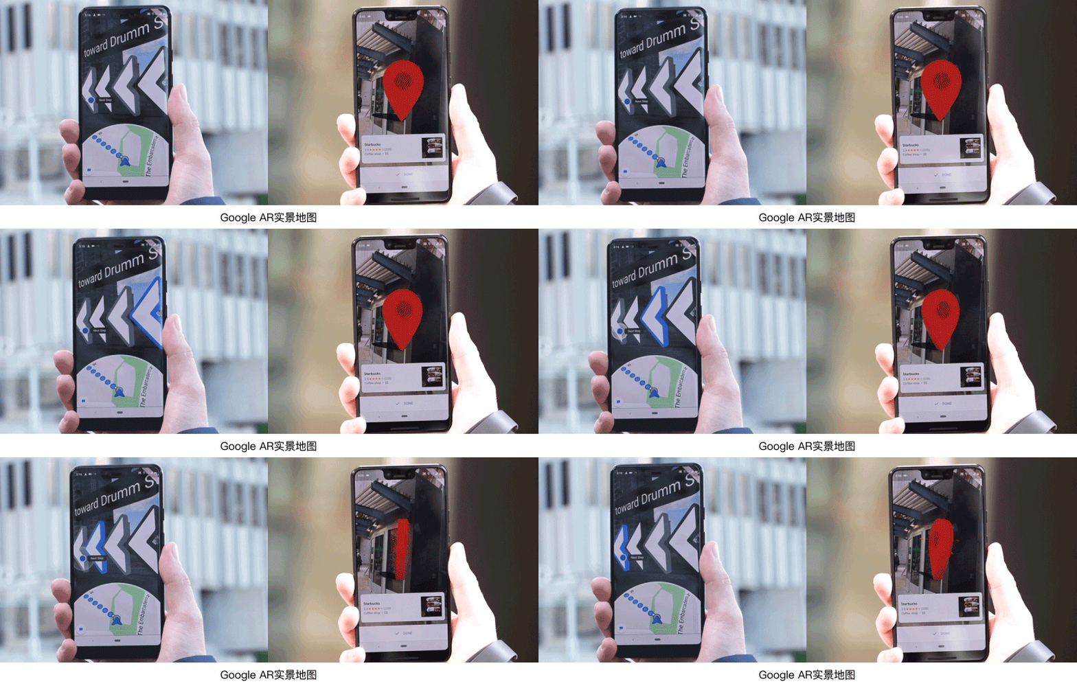
Google地图推出了AR实景导航。屏幕上面部分会展示实景内容,底部显示数字地图,屏幕中会有大大的3D引导箭头引导。AR的交互行为模拟真实世界中的用户行为,让用户能很快明白怎么使用。因此需要通过最简单的模拟真实环境的呈现方式,来传递核心信息,3D元素的设计能聚焦视觉引导用户操作,加上符合物理性的动效,对现实生活中的重力、惯性模拟,使3D元素看上去更真实自然。
Google Maps provides AR real-world navigation. The top area of the screen will show the real scene content, while the bottom shows the digital map, and there is a large 3D arrow to guide the orientation. The interactive behavior of AR simulates user behavior in the real world, allowing users to quickly understand how to use it. Therefore, the core information needs to be transmitted through the simplest simulation of the real environment. The design of 3D elements can focus on visually guiding user operations, and produce physical effects, gravity and inertia simulation in real life, by making the 3D elements look more realistic and natural.
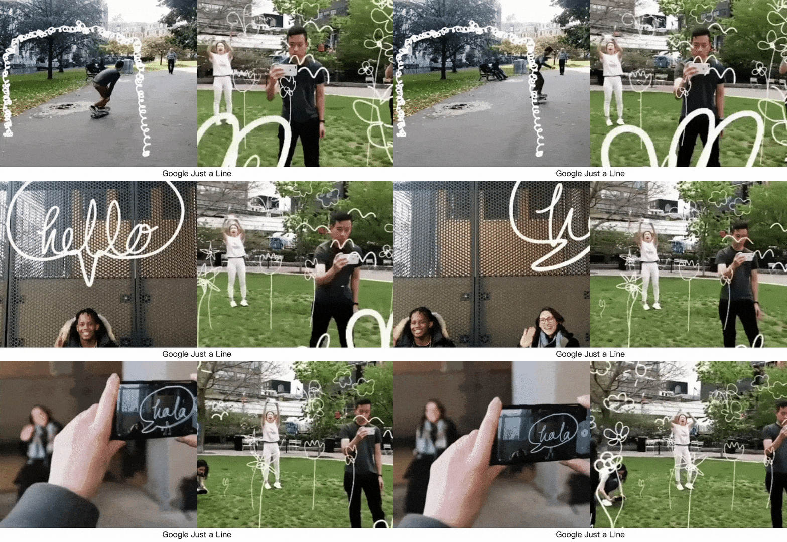
Google首款支持多人AR交互的Just a Line,通过相机拍摄,点击屏幕进行绘画,画出你想表达的画面。
Google provides the first app, which supports the multi-user AR interaction, “Just a Line”, according to shoots through the camera, and then taps the screen to draw, and draws the picture you want to express.

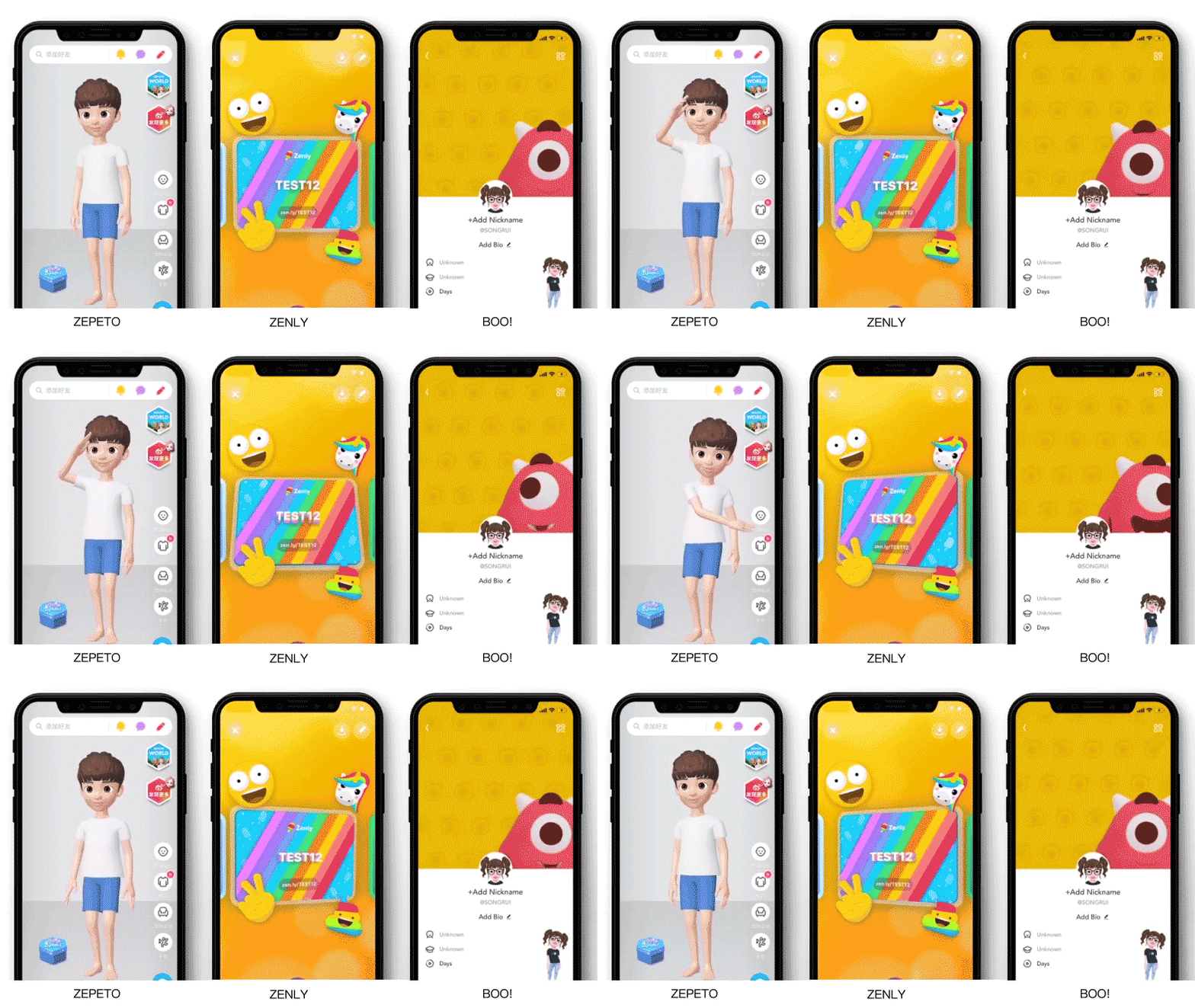
除游戏外,有许多以3D为展示形态的产品进入了我们的视线,如使用3D Avatar为用户定制形象的“ZEPETO”、“IMVU”;使用3D的角色作为界面设计元素的“BOO!”,“ZENLY”在界面卡片使用陀螺仪效果让卡片拥有立体的效果变化。3D的手法已经在产品设计中的使用的更加频繁。
In addition to games, there are many products in the 3D display style, such as “ZEPETO” and “IMVU”, which use 3D Avatar to customize the image for users; “BOO!” uses 3D characters as interface design elements, and “ZENLY” uses the gyroscope effect on the interface card to make the card have a stereoscopic effect change. 3D techniques have been used more frequently in product design.
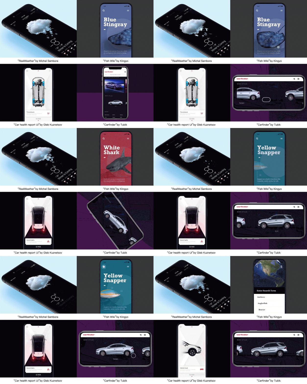
除了更新鲜的视觉感受外,3D的手法也可以更好地服务于“商品”的展示,让用户对产品有更直观的了解。我们可以看到更多真实环境或产品的展示使用三维的方法表现。
In addition to a fresher visual experience, 3D’s approach can also better serve the display of “goods”, giving users a more intuitive understanding of the product. We can see more real-world environments or product presentations using a three-dimensional approach.
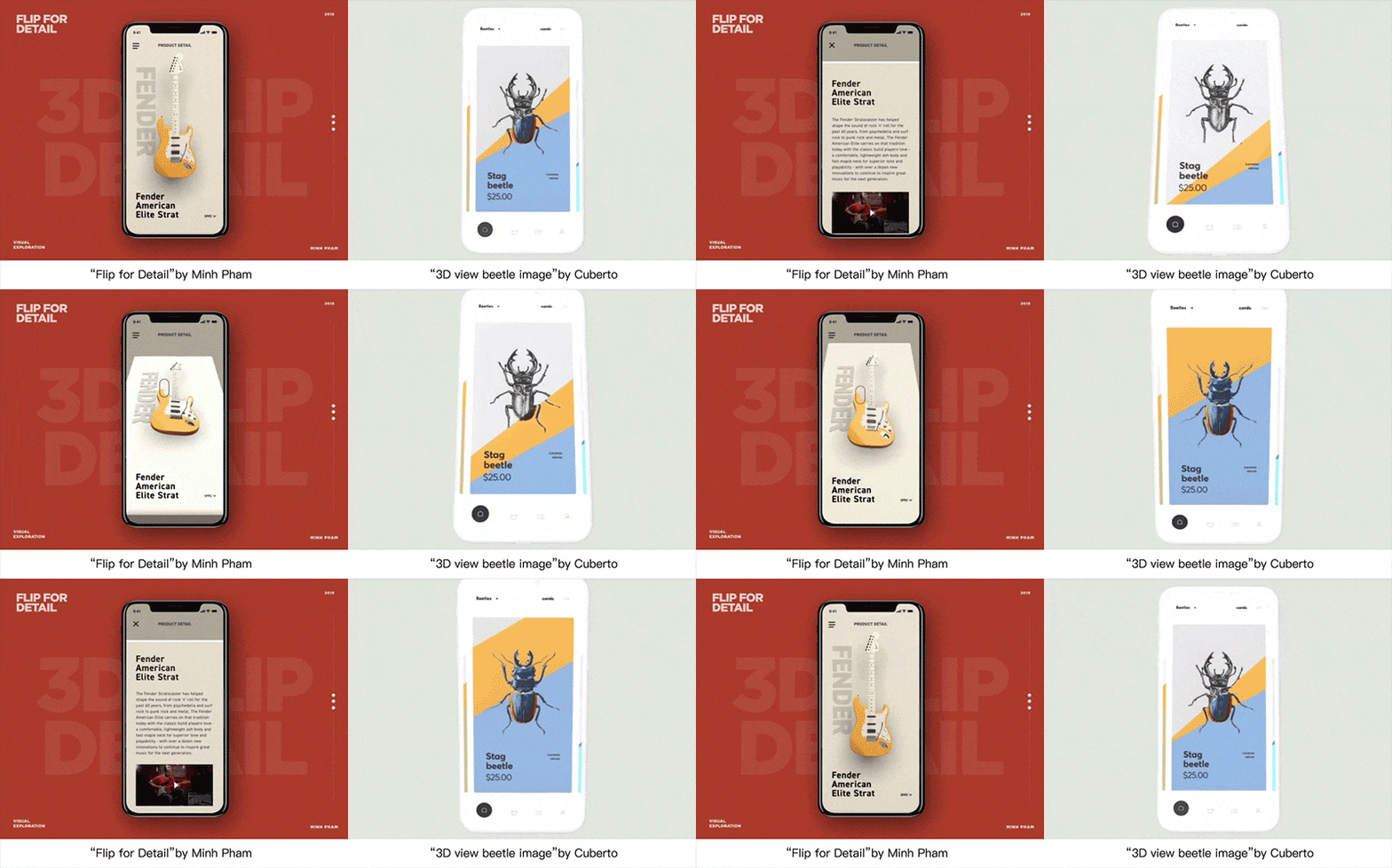
设计师也可利用三维空间的表现力,将产品页面打造成一个更加立体与真实的空间。在用户操作屏幕的过程中,带来更流畅与真实的体验感受。
Designers can also use the expressive power of 3D space to create a more solid and real space for product pages. In the process of the user’s operation of the screen, it brings a smoother and more realistic experience.

“知夜晚而不睡”的人群越来越多,他们拥有更多碎片化和大段闲暇时间来消费内容,app的设计需要更有沉浸感。
There are more and more people who “know that it’s too late but do not sleep at night”, and they have more fragmentation and leisure time to consume content, so the app design needs to be more immersive.

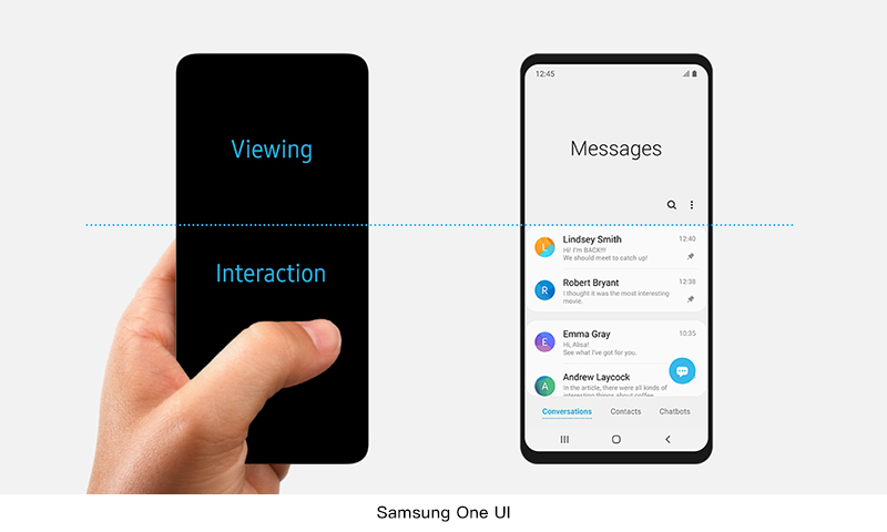
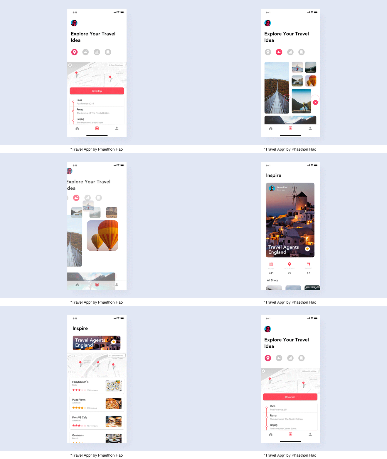
屏幕尺寸越来越大影响着用户日常操作的方便性。界面的设计如何能提升大屏手机的操作效率和使用体验?三星的One UI让手机屏幕分成两个区域,上面的区域用于查看内容,下面的区域用于交互操作。
The increasing size of the screen affects the convenience of the user’s daily operations. How can the interface design improve the operating efficiency and experience of large-screen mobile phones? Samsung’s One UI divides the phone display screen into two areas: the upper area for viewing content and the lower area for interactions.
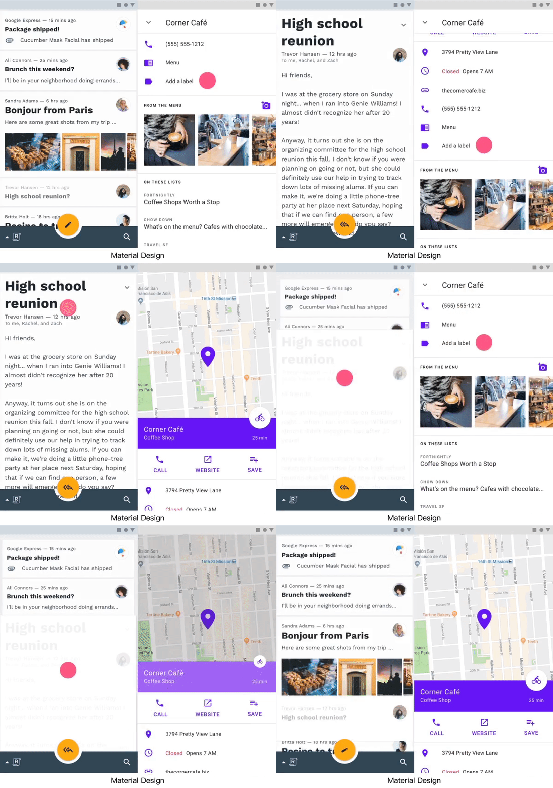
为了方便页面层级切换,增加了下滑退出的手势。
In order to facilitate page level switching, a gesture of a sliding exit is added.
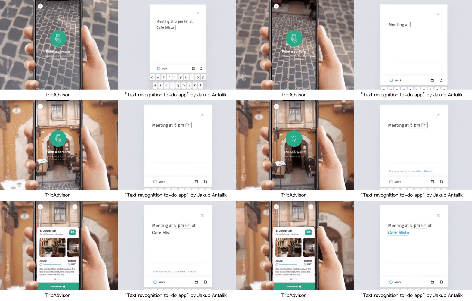
屏幕上的操作和内容根据用户操作发生变化,让用户更容易注意到已完成的操作,并提示下一步的操作。信息在用户需要的时候呈现,减少用户的认知负荷。
The operations and content on the screen change according to the user’s actions, making it easier for users to notice the completed operation and prompting for the next step. The information is presented when the user needs it, reducing the user’s cognitive load.
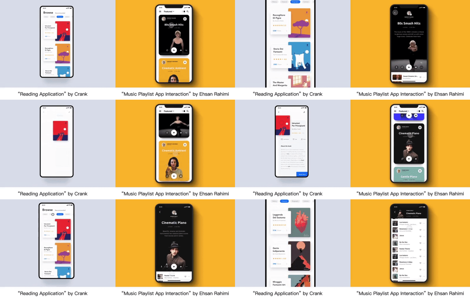
更灵活与有连续性的页面转换效果也可以帮助用户在页面跳转间更好的记住产品路线,同时带来更舒适的使用感受。页面之间的转换不再只有简单的四个方向的进入或拉起,而更是与内容形态相关的灵活的转换过程。用户通过手势对页面进行有方向的操作时,将得到连贯的操作体验。
More flexible and continuous page transition effects can help users better to remember product routes during page jumps, while providing a more comfortable experience. The conversion between pages is no longer only a simple four directions of entry or pull, but a flexible conversion process related to the content form. A consistent operation experience will be obtained when the user performs a directed operation on the page through gestures.


为了更好地服务于内容,我们看到许多的产品去掉了顶部的“色块”的设计。需要带给用户更沉浸的体验,所有“生硬”的分割形式也将不再流行。而在这其中,白色与黑色的全屏幕底色可以更加凸显产品内容本身的差异化,而不是页面表现的差异。
In order to serve the content better, we saw many products removed from the design of the “color block” at the top area. To bring users to a more immersive experience all “hard” segmentations will no longer be popular. Among them, the white and black full-screen background color can highlight the differentiation of the product content itself, rather than the difference in page performance.
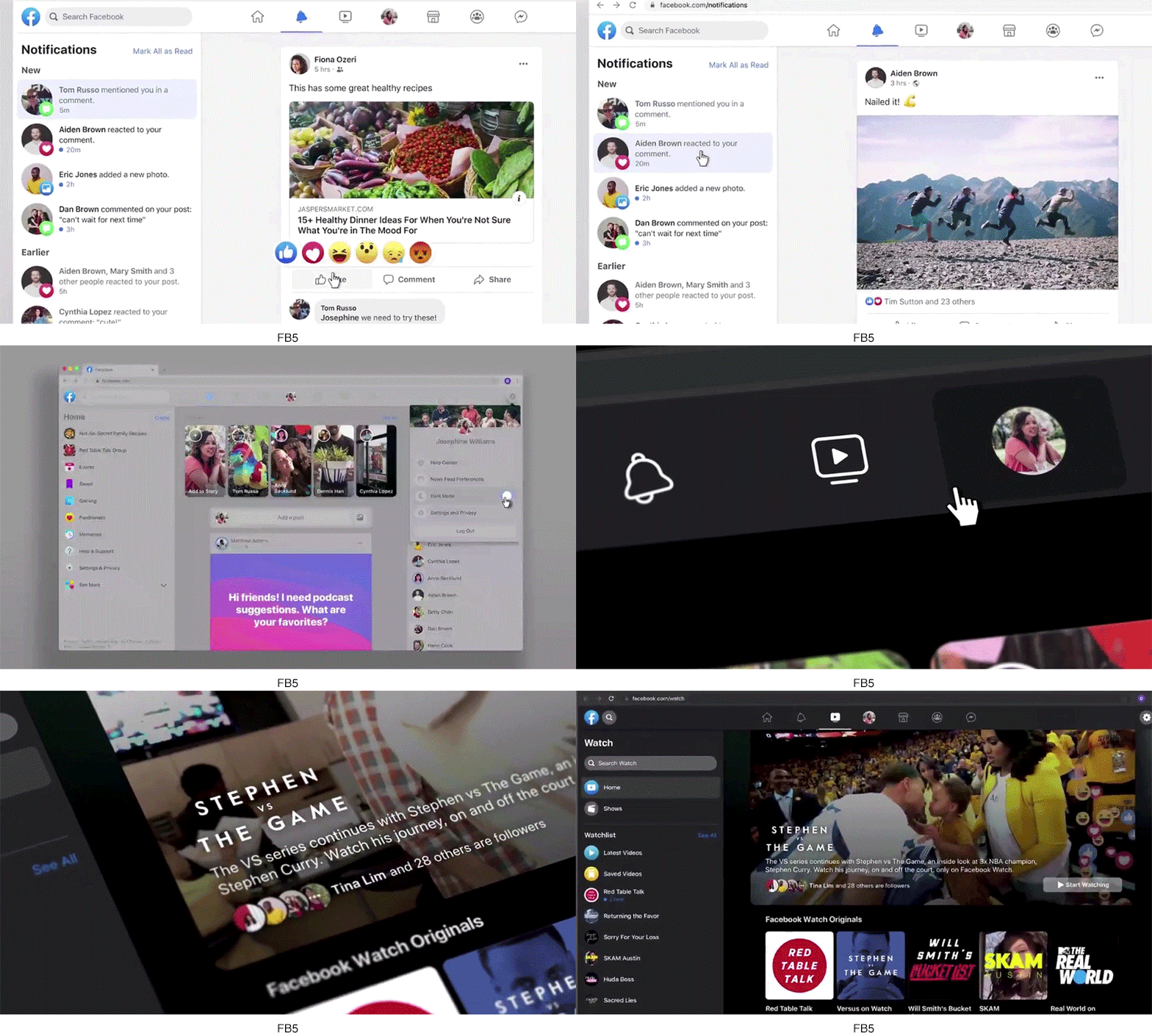
在4月底Facebook推出了新的更简单、更沉浸式的“FB5”设计风格,除开去掉厚重的顶部蓝色块的设计外,新加入的“黑暗模式”将先出现在视频观看的模块中,这将更好地服务于视频内容的观看。
At the end of April, Facebook introduced a new simpler and more immersive “FB5” design style. In addition to removing the heavy top blue block design, the newly added “dark mode” will appear first in the video watching module, which will better serve the watching of video content.
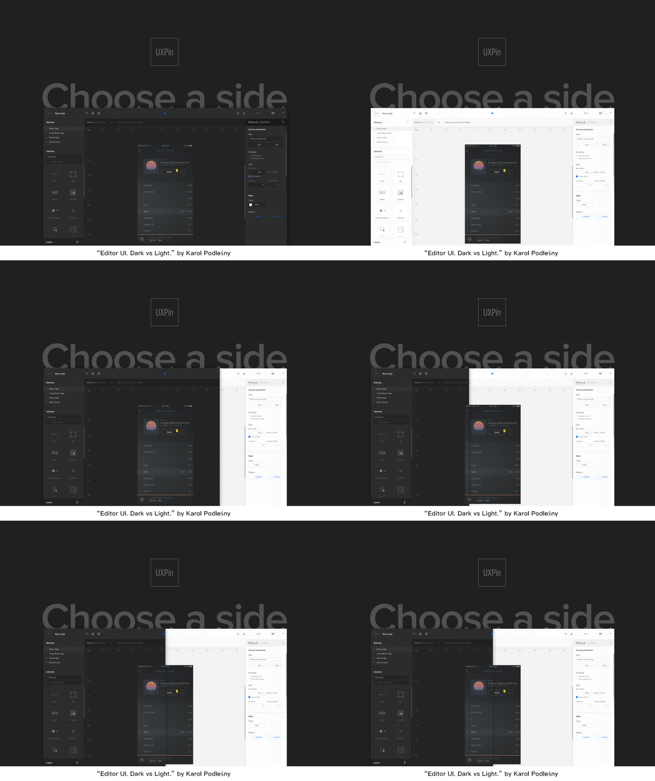
“黑暗模式”将出现在更多APP在设计中。在满足用户在浏览内容时的“沉浸感”的同时,APP可以在夜间帮助用户开启“黑暗模式”,服务于用户在夜间暗环境下的使用,减轻屏幕过亮的视觉疲惫。
The “dark mode” will appear in more app design. While the “immersion” of the user during browsing the content, the APP can help the user to turn on the “dark mode” at night, serving the user in the dark environment at night, and reducing the visual fatigue of the screen.

00后喜欢多互动强体验,内容+互动赋予了内容新的可能性。互动视频让用户增加代入感、获得个性化的游戏体验,也让内容更具有娱乐性和新鲜感。
The Post-00s likes multiple interactive experiences, and the content+interaction gives new possibilities for content. The interactive video allows users to increase their sense of participation and get a personalized game experience, moreover making the content more entertaining and a dose of novelty.

电影、游戏、网剧都推出了互动作品,用户从第三视角转向第一视角进行主动参与选择,成为高度个人化的内容。互动视频不仅要保证故事内容的优质,还要保证互动体验,对内容的交互必须是有意义的、影响剧情发展的,这样的互动才有效、才能更加触动用户的情感。
Movies, games, and online dramas have all launched interactive works, and users have taken the initiative to participate in the selection from the third perspective to the first perspective, and these works are becoming highly personalized content. Interactive videos not only guarantee the quality of the story content, but also guarantee the interactive experience. The interaction of the content must be meaningful and affect the development of the story. This kind of interaction is effective and can touch the user’s emotions.

00后不看电视,主要用智能手机获取感兴趣的商品和服务。移动支付改变了用户的付费习惯,用户愿意为自己感兴趣的内容付费。
The Post-00s does not like to watch TV, but mainly use smart phones to get goods and services. Mobile payment changes the user’s payment habits, and users are willing to pay for the content that they are interested in.
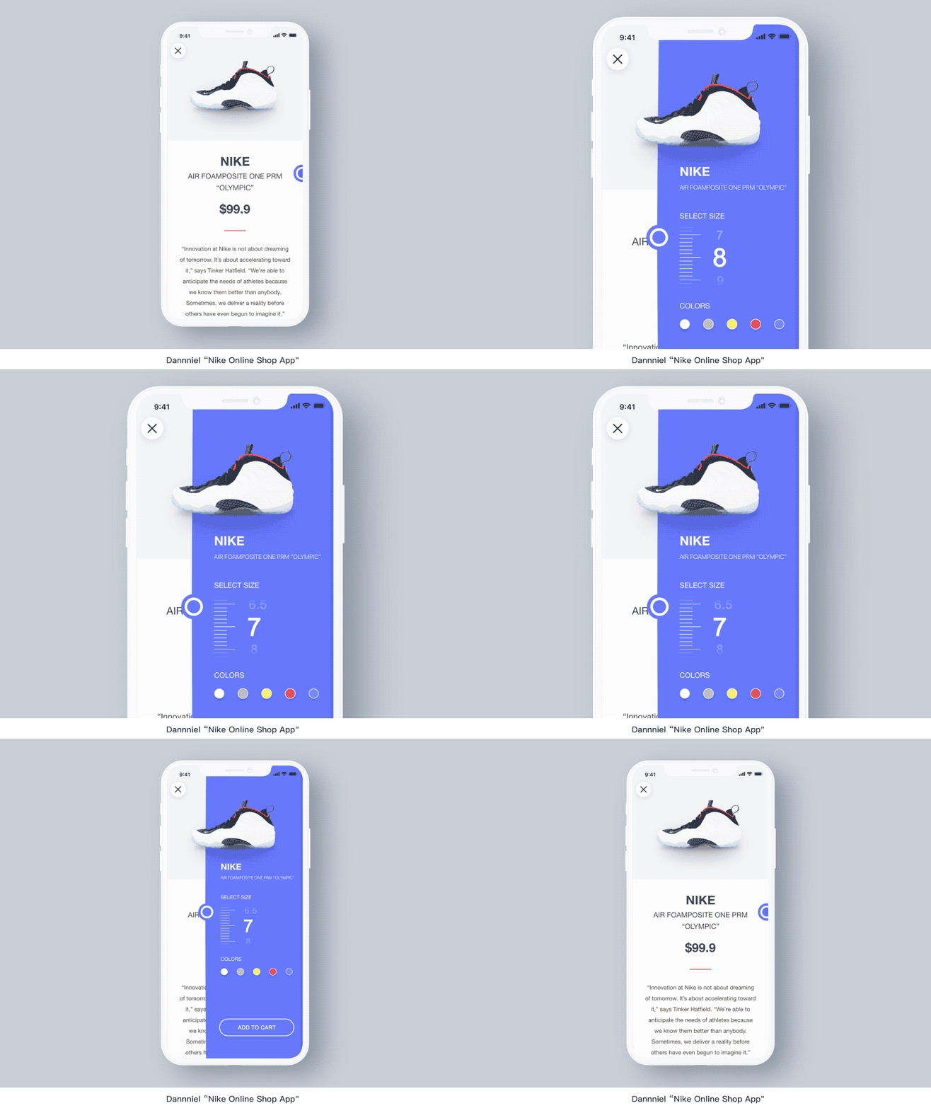
以内容为载体的电商给用户带来更加信息丰富化和娱乐化的体验方式,用户消费内容的同时可以随手进行购物。
The content-based E-commerce provides users with a more information-rich and entertaining experience that allows users to shop while they consume contents.

年轻的互联网用户们,在高速发展的科技与文化环境下成长。也自然地造就了这些用户对产品审美上更高的追求。近几年,拥有自我个性的“小而美”的设计也更容易打动用户。
Young Internet users are growing up in a fast-growing technology and cultural environment. Naturally, these users have made a higher aesthetic pursuit of these products. In recent years, the “small and beautiful” design with a self-personality has also made it easier to impress users.

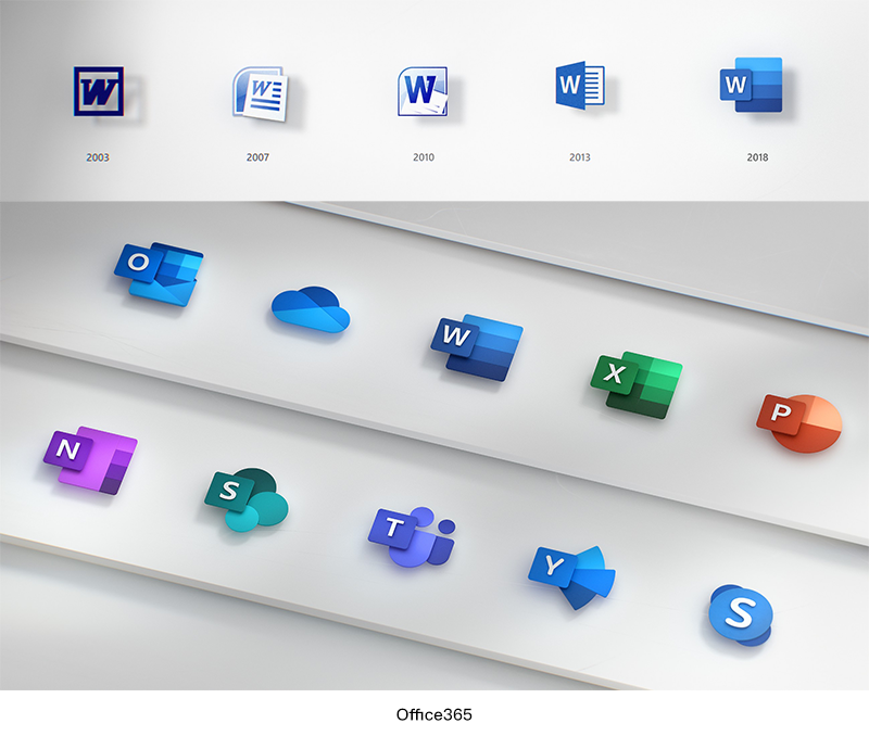
从Office365的新图标设计中,我们可以看到更抽象与符号化的图标表现。降低图标上的具象(文字区域)占比,使用更多的抽象形状表达图标所具备的含义。图标向更简洁与几何的方向发展,同时使用丰富的色彩和质感变化满足图标的辨识度。
此外,图标的设计也更讲究适配效率。Office使用了svg格式的资源以适应于不同平台的应用扩展。
From the new icon design of Office 365, we can see more abstract and symbolic icon representation. Reduce the proportion of concretization (text areas) on the icon, and use more abstract shapes to express the meaning of the icon. The icon evolves in a more concise and geometric direction, while using rich color and texture changes to satisfy the icon’s recognition.
In addition, the design of the icon is more about the efficiency of the adaptation. Office uses resources in the SVG format to accommodate application extensions on different platforms.

随着表现手法的进步,如3D元素的使用;以及动画实现技术的进步,在响应动画表现上也将更加细腻。而模仿自然的运动规律也将更为流行,“弧线运动”“光感”“粒子表现”“三维空间”等等也将提升产品的设计表现。
With the advancement of performance techniques, such as the use of 3D elements, and the development of animation implementation technology, the performance of the response animation will be more delicate. The laws of motion that mimic nature will also become more popular, such as “arc motion”, “light perception”, “particle performance”, and “three-dimensional space”, etc., which will also enhance the design performance of products.
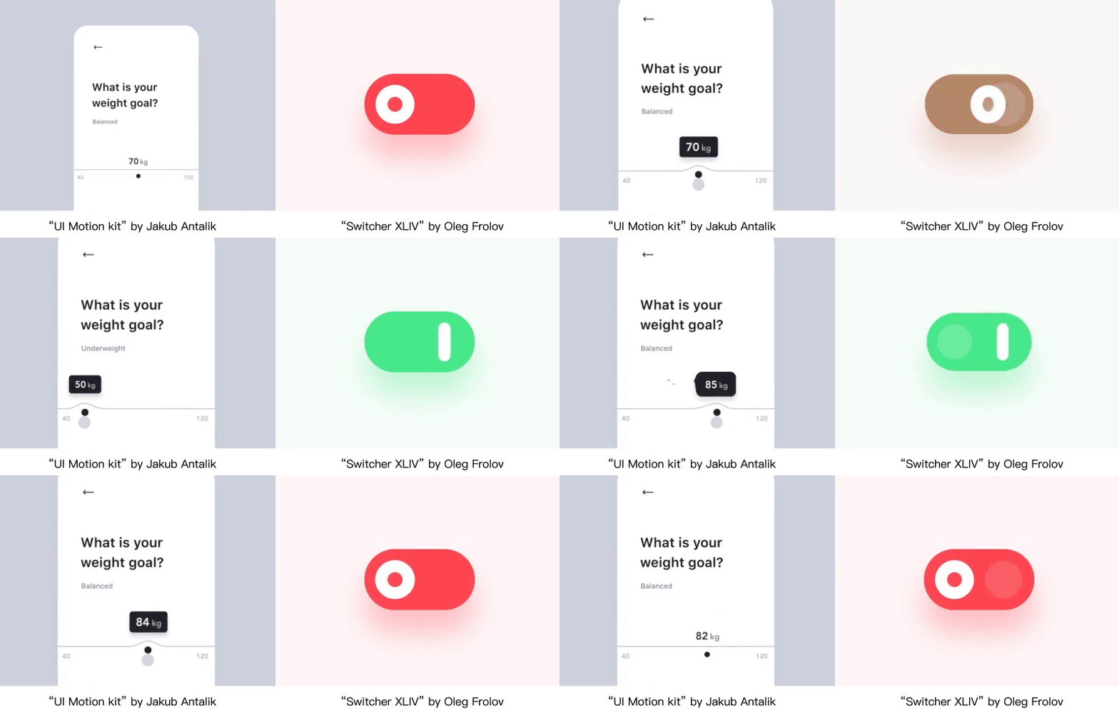
对界面中的控件而言,控件的设计将越发贴近真实的物理规则。设计师们可以通过对控件在动画上的表现赋予它们更真实的触感。
For the controllers in the interface, the design of the controllers will be closer to the real physical rules. Designers can give them a more realistic feel by expressing the controllers via animation performance.
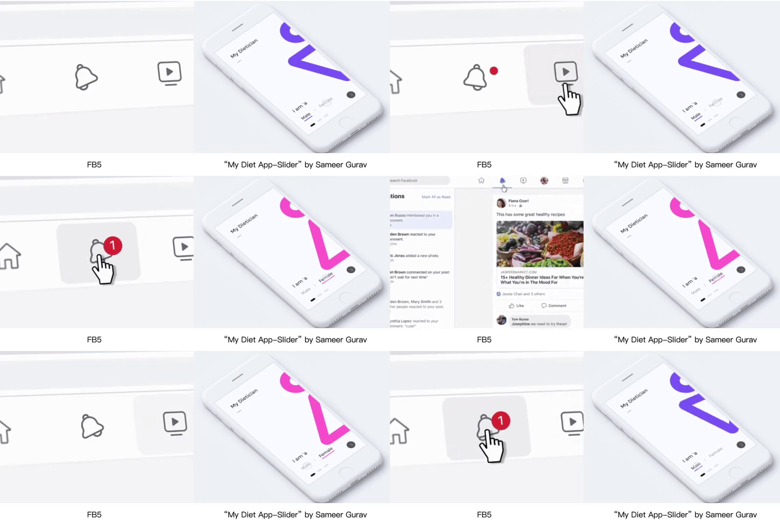
有趣的响应动画也可以带给用户更愉快和亲切的感受,而在动画中体现更多的“人情味”便是带来愉悦体验的关键。我们可以感受到图标所传达出来的情绪与性格。
Interesting response animation can also give users a more enjoyable and intimate feeling, while the more “human taste” in the animation is the key to providing a pleasant experience. We can feel the emotions and the character conveyed by the icons.

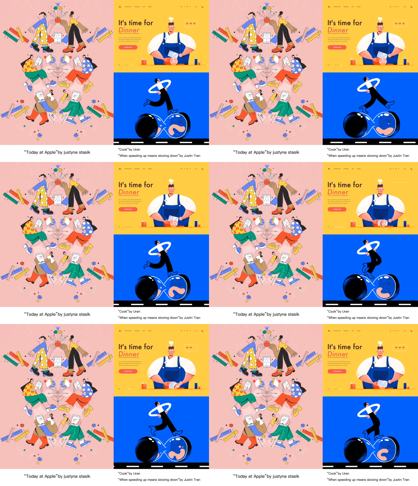
审美的提升带来最为直观的感受即是对图形本身追求的进步。所以在界面插画中,视觉艺术性的追求也更加重要。用户们早已厌倦了千篇一律的几何小人或是简单的线性图标,更具有个性的角色表现及绘画手法将更受年轻人的欢迎。
The most intuitive feeling brought about by the improvement of aesthetics is the progress pursued by the graphics itself. Therefore, in the interface illustration, the pursuit of visual art is more important. Users are tired of the same geometric figures or simple linear icons, and a more personalized character performance and painting techniques will be more popular with young people.

越来越多的电影流行彩蛋,一个小小的彩蛋能带给用户惊喜感和仪式感。我们在满足用户需求和打造用户体验的同时,可以给用户设计一些触动人心的设计。
There are more and more Easter eggs become popular in movies, a small Easter egg can bring users a sense of surprise and ritual. Some exciting designs can be provided to users while meeting user requirements and creating a user experience.
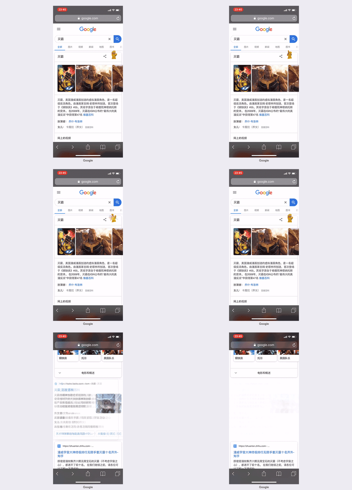
Google搜索在《复联4》热映时,加入了灭霸的彩蛋。点击无限手套,搜索结果就会随机“消失”一半。
Google search added the Easter eggs of the Thanos in the “Avengers: Endgame”. Click the Infinity Gauntlet button then the search results will randomly “disappear” half.
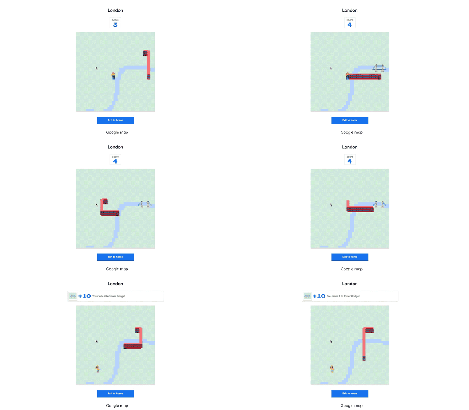
Google地图在愚人节发起了贪吃蛇游戏,可以在不同的地图上,让蛇(地铁或巴士)吃掉目标不断变长。
Google Maps launched a “Snake” Easter egg game for April Fool’s Day, which allows the snake (metro or bus) to become longer via eat the targets on different maps.
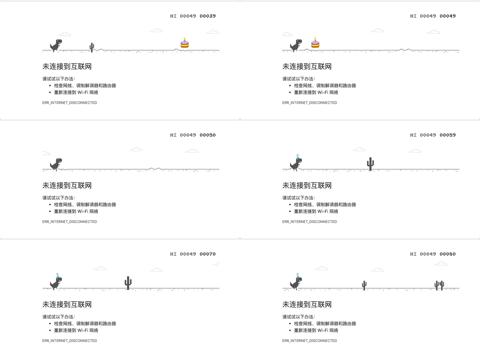
Google 为 Chrome 的生日埋了个小彩蛋,在 Dino Game 中加入了派对元素:当小恐龙吃蛋糕后即可戴上生日帽。
Google set up a small Easter egg for Chrome’s birthday and added a party element to the Dino Game: the little dinosaur will wear a birthday hat after it ate the cake.
2019年我们可以看到科技对设计、体验产生的巨大影响。《创新者的窘境》一书中描述:“每个技术由慢到快到发展至瓶颈时,另一个颠覆式的技术会悄悄萌芽,并替代上一个技术”。因此有些设计趋势会由于技术驱动突然爆发,也有可能会因为技术的颠覆而消失。作为设计师,要学会识别设计趋势中的变与不变,来进行创新和设计改良。
科技和产品最终都是回归到以人为本,设计师要洞察人性底层的需求,除了关注屏幕内的设计,还需关注屏幕外的设计,改善人们使用产品或服务的设计就是未来的趋势。
In 2019, we can see the huge impact of technology on design and experience. The book “The innovator’s dilemma” describes that “every technology from slow to fast to the bottleneck, another subversive technology will quietly sprout and replace the previous technology.” Therefore, some design trends will suddenly disappear due to being technology-driven, and may also disappear due to the subversion of technology. As a designer, we should to learn how to recognize changes and constants in design trends for innovation and design improvement.
Technology and products are ultimately returning to becoming people-oriented, so designers need to understand the requirements of the bottom of human nature, not only to focusing on the design inside the screen, but also to pay attention to the design outside the screen, and improving the design for people using products or services is the future trend.
转载注明:YRUCD
原文地址:ISUX
![印刷平面设计超级大礼包合集样机下载 [购物袋/包装/礼品盒 PSD,112GB]](https://static.yrucd.com/wp-content/uploads/2020/03/0--300x200.jpg)




![实用的sketch规范制作模版下载[Sketch]](https://static.yrucd.com/wp-content/uploads/2017/11/guifan1123banner.jpg?x-oss-process=style/s1)
![免费的大气风格的手写英文字体打包下载[woff,otf,ttf]](https://static.yrucd.com/wp-content/uploads/2017/04/luckyFontb.jpg?x-oss-process=style/s1)


